I remember the first time I tried Brazil render. I turned on GI, put a sphere on top of a plane and hit render. I couldn’t believe how real everything looked compared to the scanline renders I was accustomed to viewing. Fast forward 20 or so years and here we are today -with TONs of amazing CG artists and renders. These artists are always pushing the boundaries to the point of people asking, “Is that real or CG.”
Over the last ten years, I’ve struggled to try and get the “real” look that matches many of the great photographs I've seen in magazines, online, and other renders I’ve seen from great CG artists. Honestly, I gave up about five years ago and figured there was some gimmick or plugin I wasn’t aware of and that eventually, I’d stumble across a tutorial online. Maybe my models were crappy? Perhaps I was missing a setting in V-Ray that would solve everything? At the time I knew that a good, real CG scene required a combination of materials, lighting, style, and design, but even still: Something was missing from my process.
It wasn’t until my wife asked me to take photos of a real estate listing that I started to understand what I was missing.
99% of the stuff you see isn’t “real.”
Even pure real estate photography isn’t “real.” By real, I mean what your eyes see at the location, and what you see in the photograph of a listing are very different. In Hollywood- We all assumed this is the case. But in real estate photography too? Before my shoot, my understanding of at a typical interior shoot was you wait for good lighting, set your camera on a tripod, find a good composition, set your exposure, and then click the button. (Note: Sometimes this can work, and it often does, but with this approach, the reliance on styling and an exciting subject become more critical.)
I went out for my first shoot feeling confident, but came back to edit the photos and realized what I had vs. the expectation missed the mark. I also noticed something similar happening with the pictures I took and the renders I was producing. They were both flat, boring, and lacked magic. I became curious to dig in further.
I started searching online for various real estate photography courses. (because this house wouldn’t sell with the photos I took) I stumbled across Mike Kelley's Where Art Meets Architecture 1 bought the tutorial, and after watching it, my eyes were open to details I had never noticed. There’s A LOT that goes into a successful interior image.
Most of all, the tutorial trained my eye for details in images. It helped me with the use of bounce lighting, using strobes to add depth, using lights to highlight chrome and other reflective materials, removing unwanted reflections, color, composition, and so much more. (The cool thing is, many of the tricks in the tutorial are much easier to do in 3D. In 3d, we can set our lights to invisible.) All these aspects become especially important when your location is not already the most amazing architectural achievement ever.
I ended up going down the rabbit hole further and eventually started learning more about lighting used in film and commercials. I watched break down after break-down on Cinematographydb (before they got taken down) I began to appreciate how big of a deal great lighting is to the final product and why so much care goes into “getting the lighting right.”
Armed with my new knowledge, I decided to give another 3d architecture scene another go. I wanted to find a commercial image for refrence that showed a lot of care put into the final image. I found this Restoration Hardware image below. The image has a lot of excellent materials, an unique mood, and fun furniture to model.
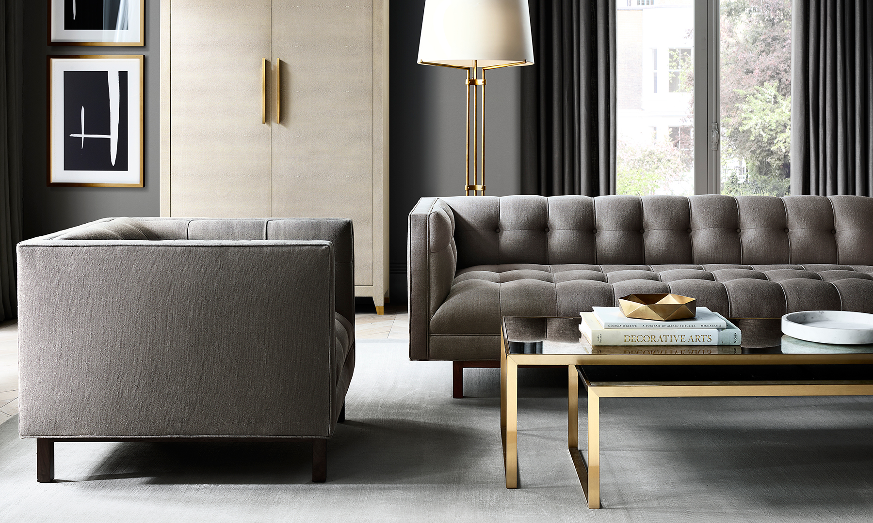
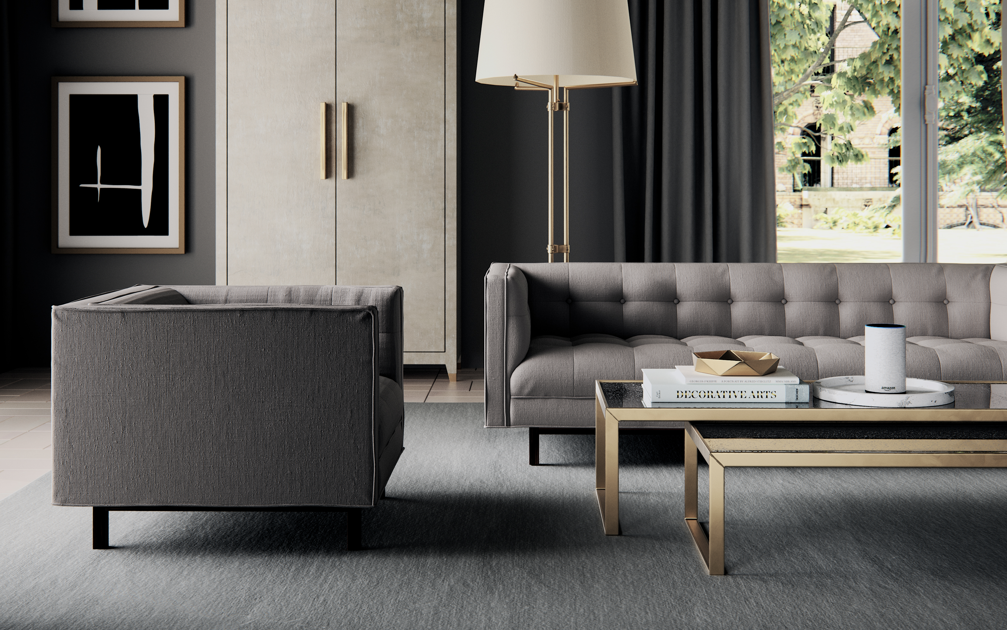
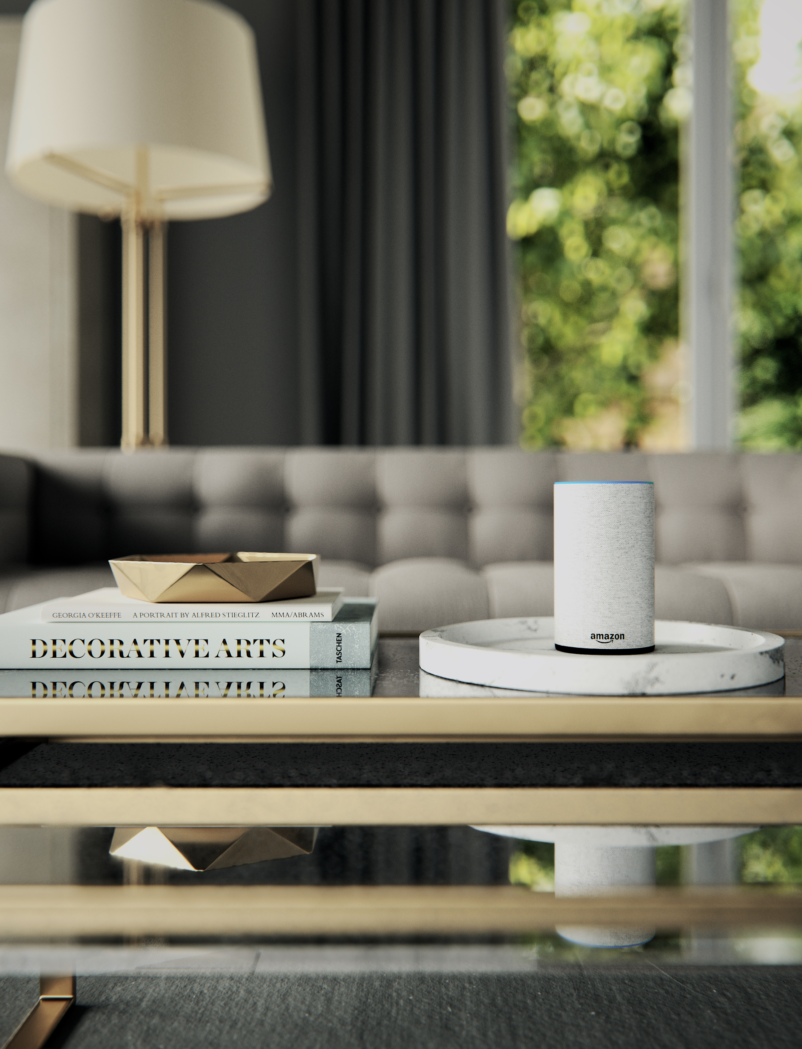
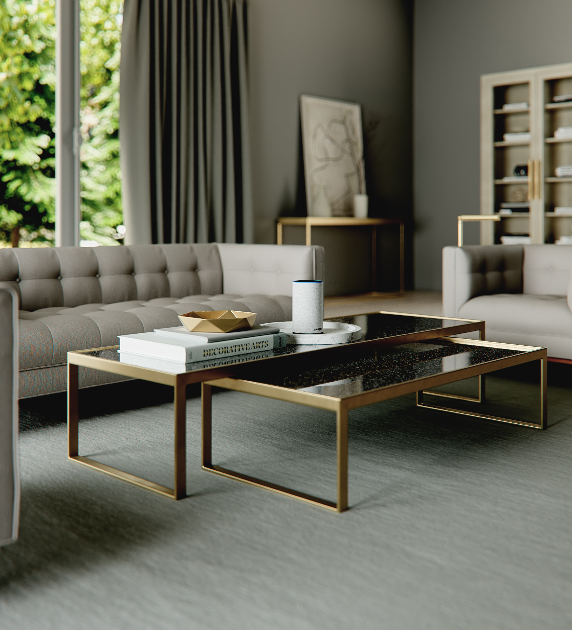
Here are my final images. I added in an Amazon Echo into the scene because we don’t usually produce interior images for architecture and I wanted a way to show this image in a commercially viable way outside architecture.
I included the scene at the end of the page with some free models as a bonus. I can’t include every model, but I’ll include all that we created originally. I also can’t add all the textures because they are also from different places and I don't have the rights. Hopefully, you still find a use. There are tons of modeling tutorials out there so I won’t go into much detail there. Let's jump right in.
For this walkthrough, I’m going to try and narrow my focus on lighting and how that can help shape a scene and add depth as well as the effect it has on the realism of materials.
Here’s a clay model of the scene with my camera set to Auto Exposure. This render is using available natural light. This setup is a very typical scenario for an interior view.
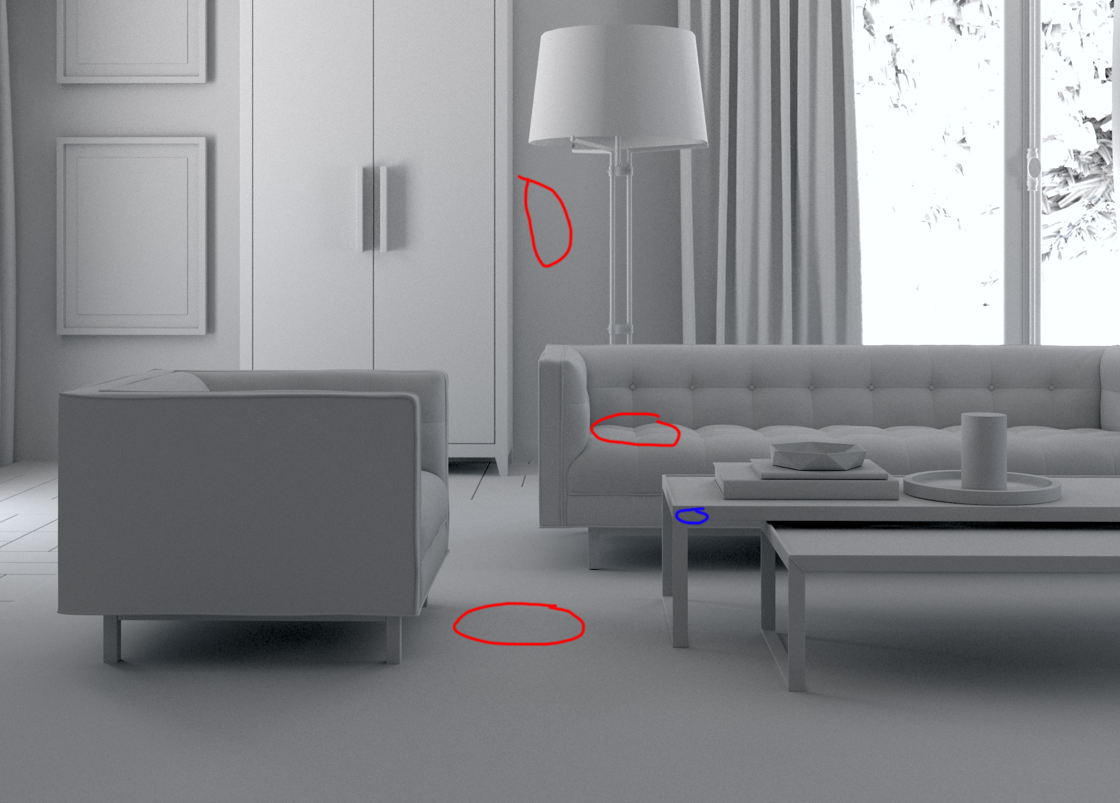
I want to bring your attention to the lack of shadow depth in red and the lack of light blue. You lose a sense of the dimensionality of those objects with the current lighting. The whole point of this particular photo is to help the viewer imagine what this furniture could look like in their own space. So dimensionality and contour to the furniture is extremely important.
To help add depth to the furniture, and highlight the gold materials, I added six lights around the scene. You can see a break down below.

I used the following lights in the final image:
Natural light: For the most part, the sun is lighting the exterior only.
Table light and black flag: The table light and blag flag help add to the realism of the table. I added in black flag camera right to give the gold something with contrast to reflect.
Light above chair: To add depth and shadows to the chair
Cabinet fill: This light casts a nice shadow on the wall, brings out the gold handles, and help demonstrate the roughness and texture of the cabinet.
Fill for blinds: Helps add a little shading to the inside
Back sofa: Adds depth to the tuffs and overall look
Lamp: Very very subtle but the lamp is indeed on.
The last area I want to point out is the exterior of the image. I used to think I could get away with an image texture applied to a plane. Sometimes you can do this, but having a real detailed exterior helps add realism. There's a subtle color bleed from the exterior and a more realistic bokeh when using depth of field.
I hope this tutorial was helpful in some way. If you have questions or ideas for future tutorials feel free to reach out. There’s a lot of really great CG resources and tutorials out there. I highly recommend Johannes Lindqvist’s patreon and of course the great Grant Warwick at Mastering CGI.
Download free models here.